
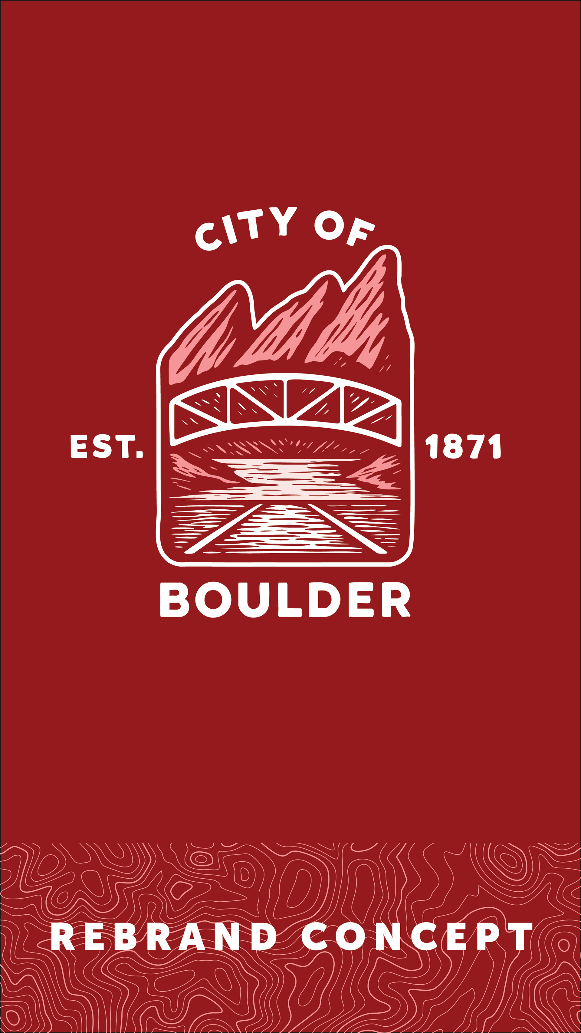
Exploring the Mark: “Didn’t you know? We live in a postcard.”
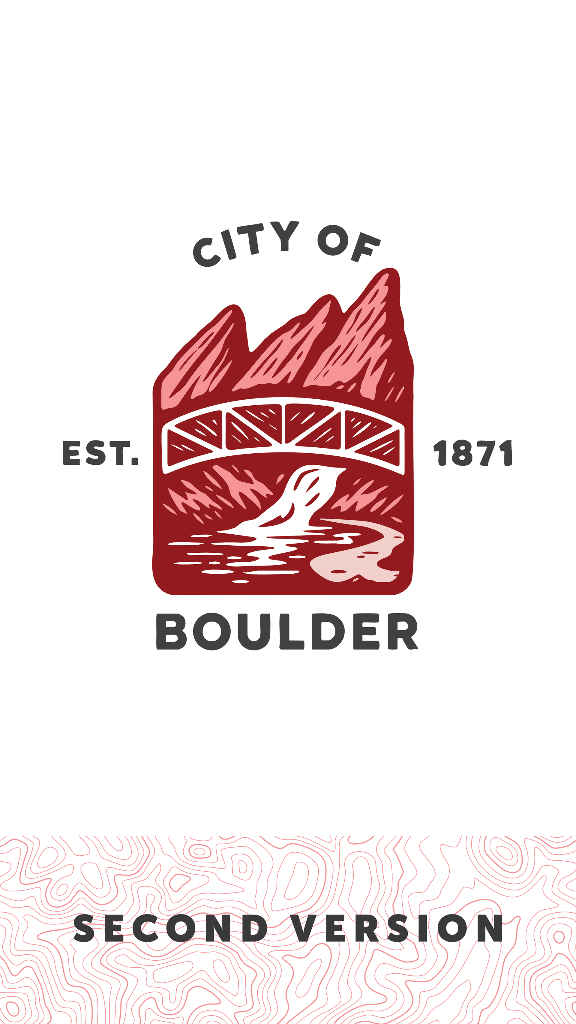
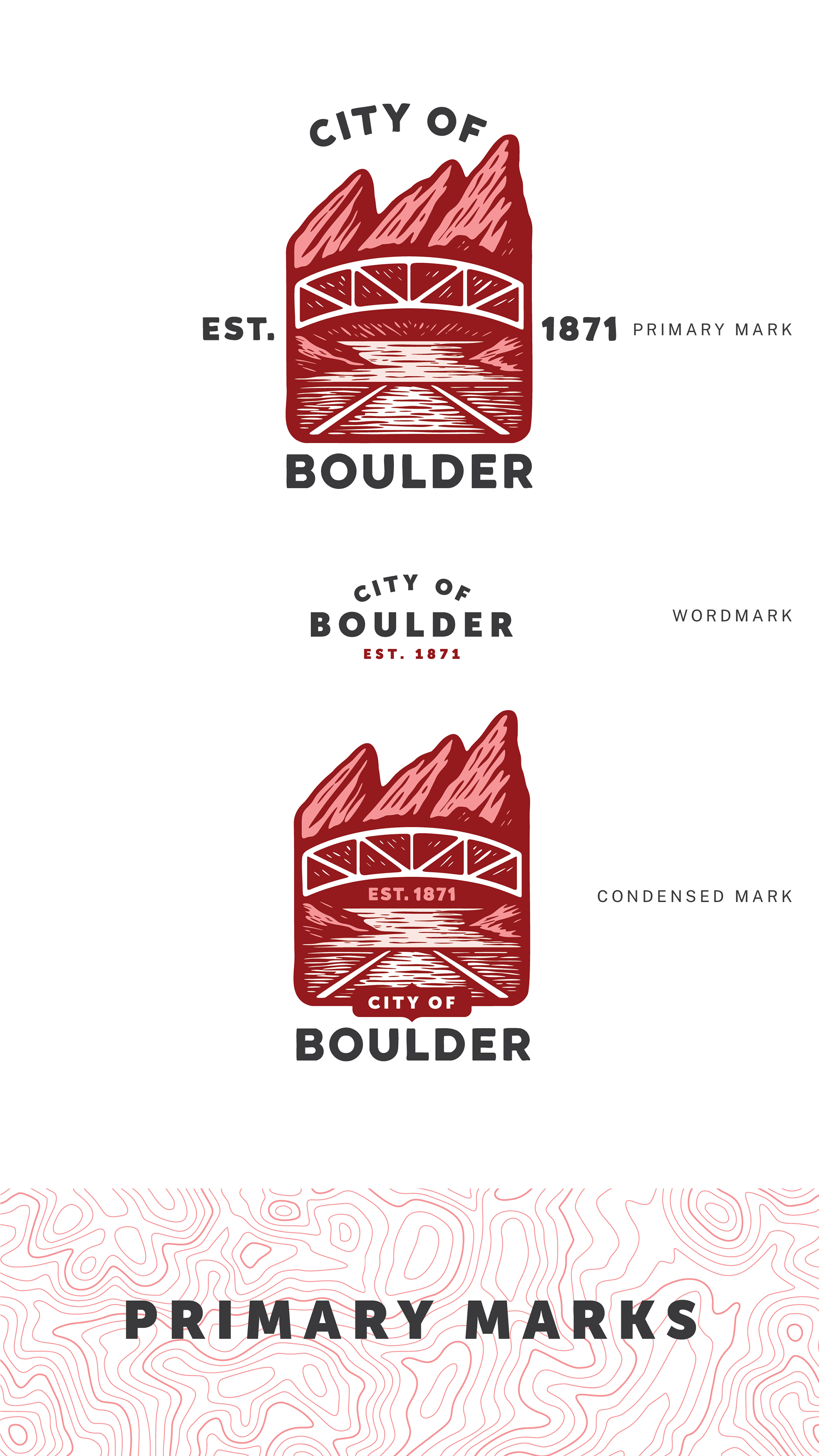
Our beloved Flatirons are Boulder’s iconic backdrop. They witness everything—from birthday parties in Scott Carpenter Park to promotions and graduations. They ground us, inspire us, and connect us to our sense of place.
Boulder Creek runs through the heart of The Mark, inviting you to spend a day along the banks of Eben G. Fine Park. It’s the main artery of our outdoor lifestyle and a living symbol of connection. The bridge crossing the creek nods to our commitment to sustainability and our vast network of multi-use pathways.
The winding path at the base of the mark evokes our deep-rooted connection to nature—an access point, a reverence, a rhythm. In Boulder, the natural world isn’t a backdrop; it’s embedded in our daily lives. It shapes our commutes and our leisure, our children’s first steps and our evening walks. It’s not just part of the city—it’s part of us.
The art style pays homage to Boulder’s layered history. The woodcut-inspired illustration, with its strong lines and texture, references the city’s early history and the pioneers, settlers, and Indigenous peoples who have called this rugged landscape home since time immemorial. The overall aesthetic is a tribute to the enduring spirit of all who have stewarded this land.
Type Systems: Speaking Our Brand into Life
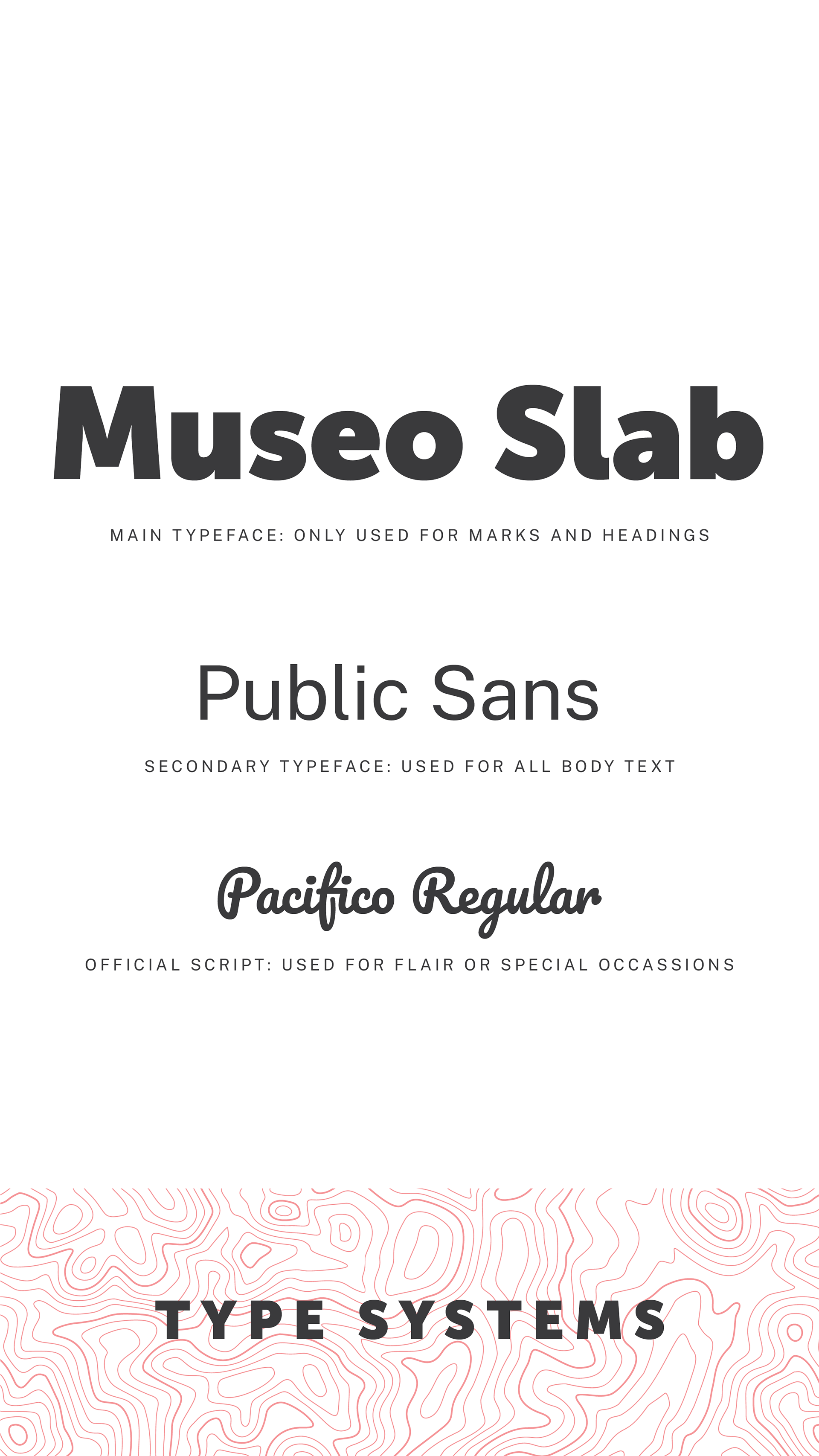
Museo Slab is used as the primary brand font. This should only be used in official marks and by city design staff. Public Sans is a free, accessible font for all users in our system and in all body copy and collateral. Pacifico Regular has been selected as the branded script font. This allows us to provide a complementary typeface to our brand and allowing some creativity and flexibility. It should only be used sparingly.
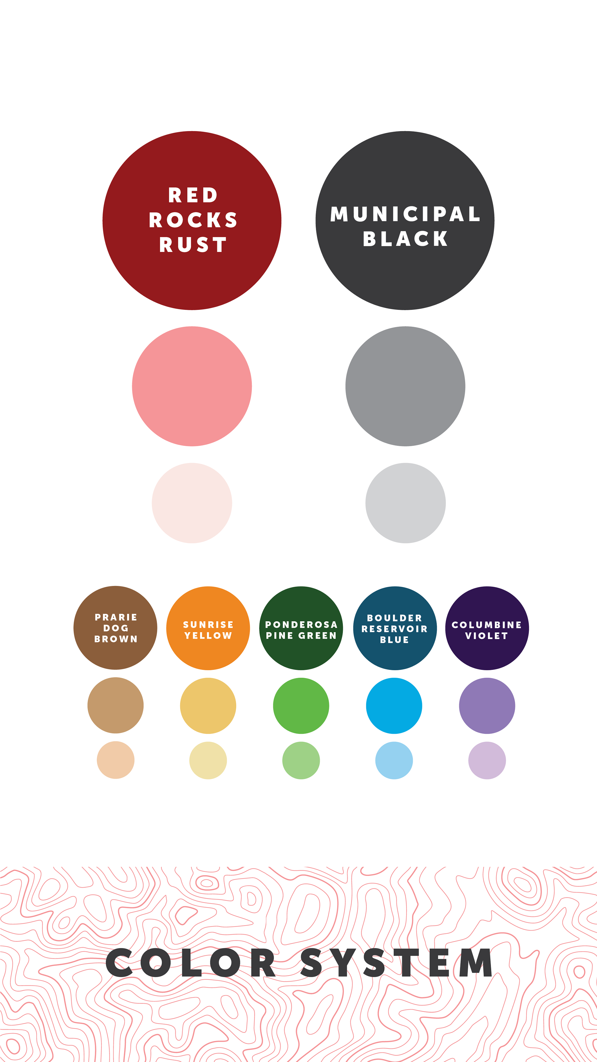
Our True Colors: Red Rocks Rust & Municipal Black
Red has always been our favorite color. It’s the dirt on our boots, the muck on our paws, the color of the mountains we love and the heart of our city: the Pearl Street Mall. Red Rocks Rust is our primary color, complemented by Municipal Black—clean, accessible, and legible across all devices.
Our secondary palette is derived from the naturally occurring flora and fauna in our backyard. All colors may be tinted to meet accessibility and legibility needs.
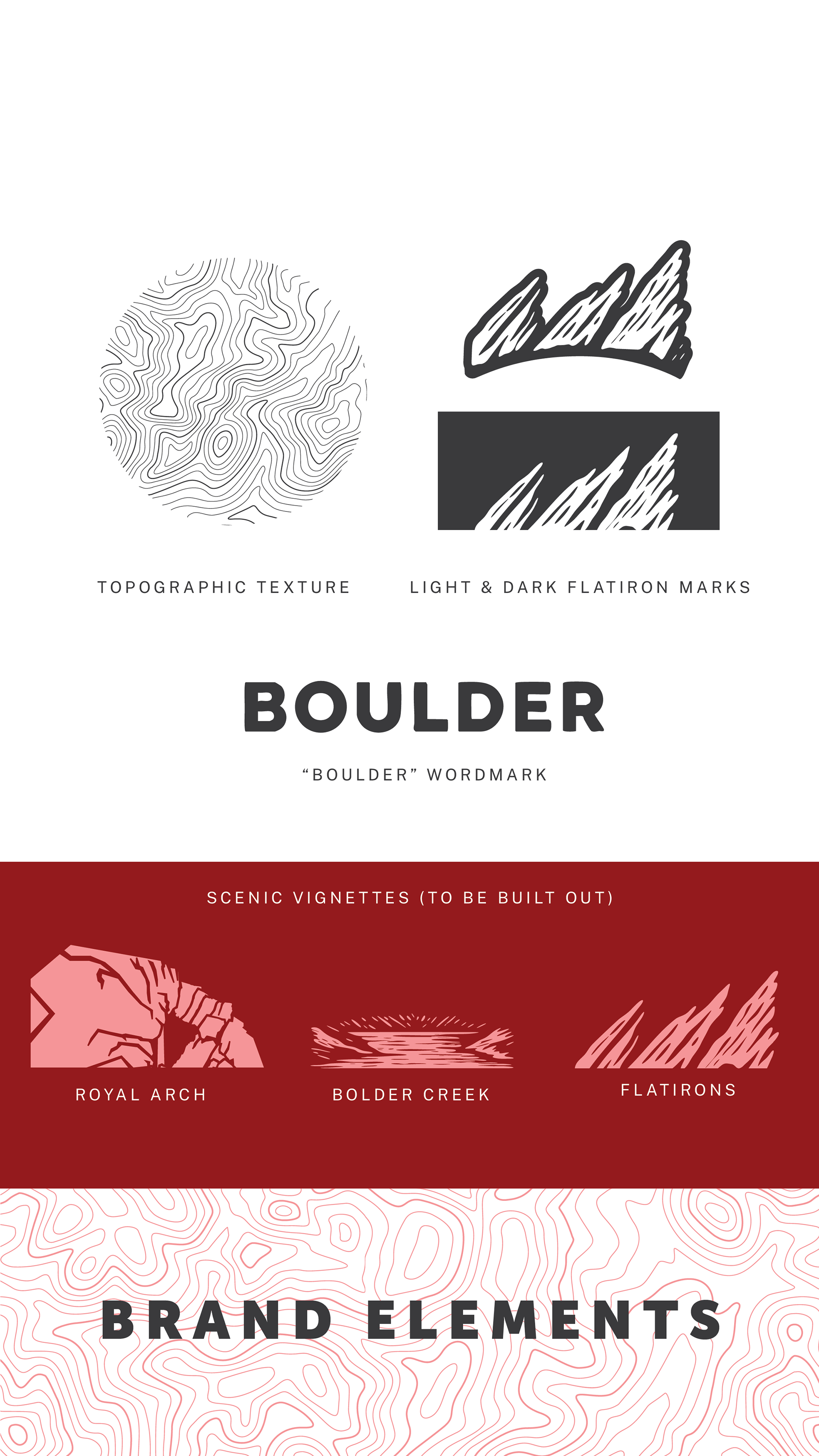
Brand Elements: Embracing Our Mountain Lifestyle (Page 6)
The topographic texture is designed for use across brand collateral. It hints at our mountainous backdrop without overstating it. The Flatiron marks may be used subtly or featured in apparel. All marks can be colored using any shade from the city brand or departmental sub-brand palettes. We’ll be developing stylistic, illustrated vignettes to be included as supplementary elements, such as the Pearl Street Mall, Royal Arch, or the Boulder Reservoir.
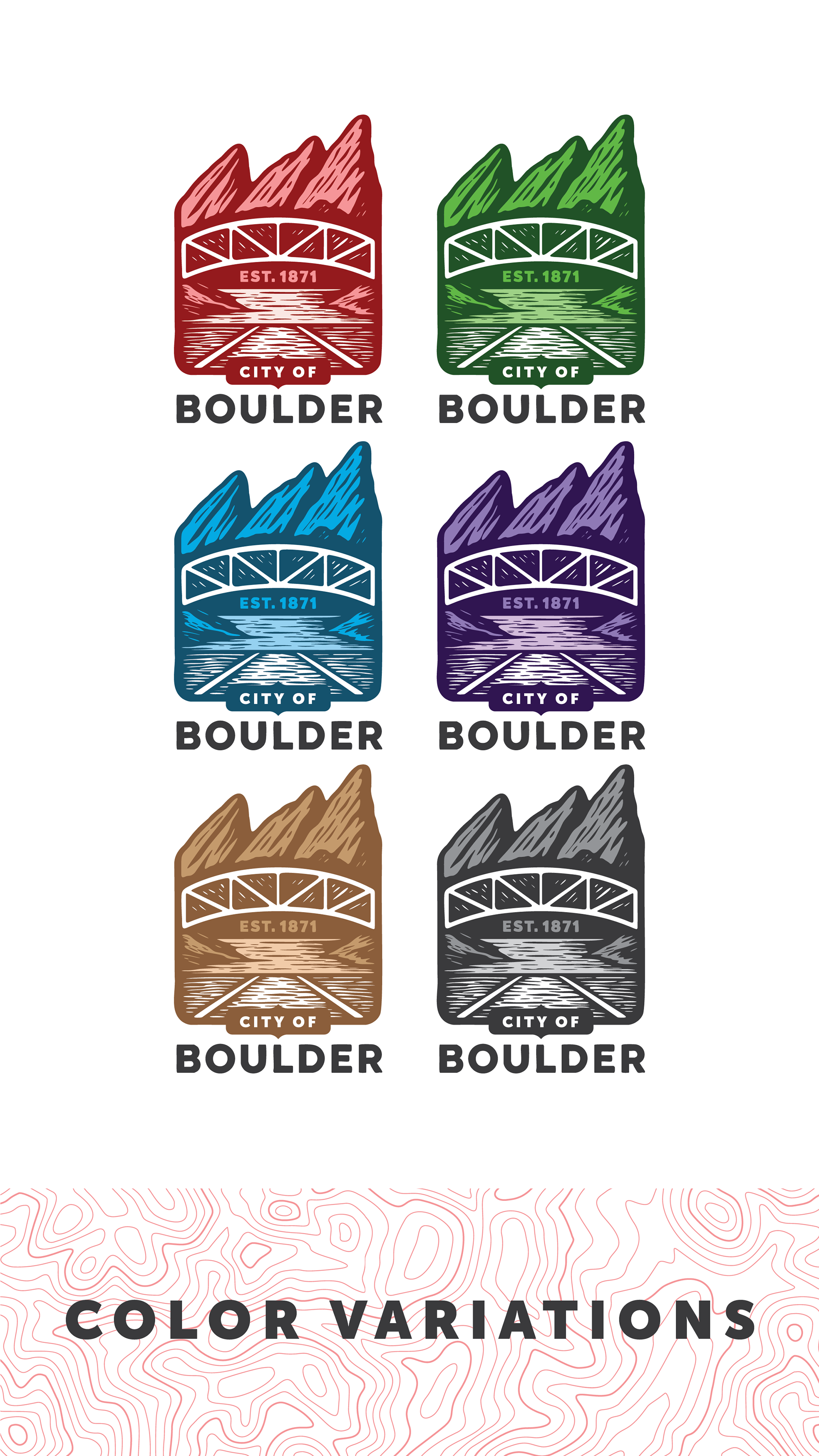
Color Variations: Celebrating Our Diverse Background & Community
While our primary mark should use Red Rocks Rust and Municipal Black, we recognize the need to color outside the lines. Approved alternate color combinations allow our brand to reach more community members and reflect the vibrant diversity of our city.
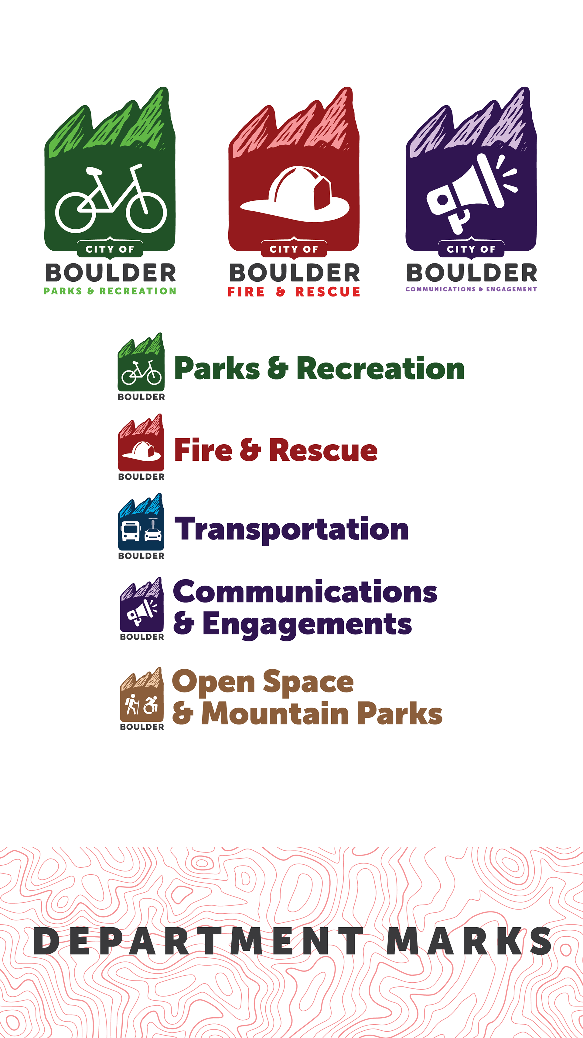
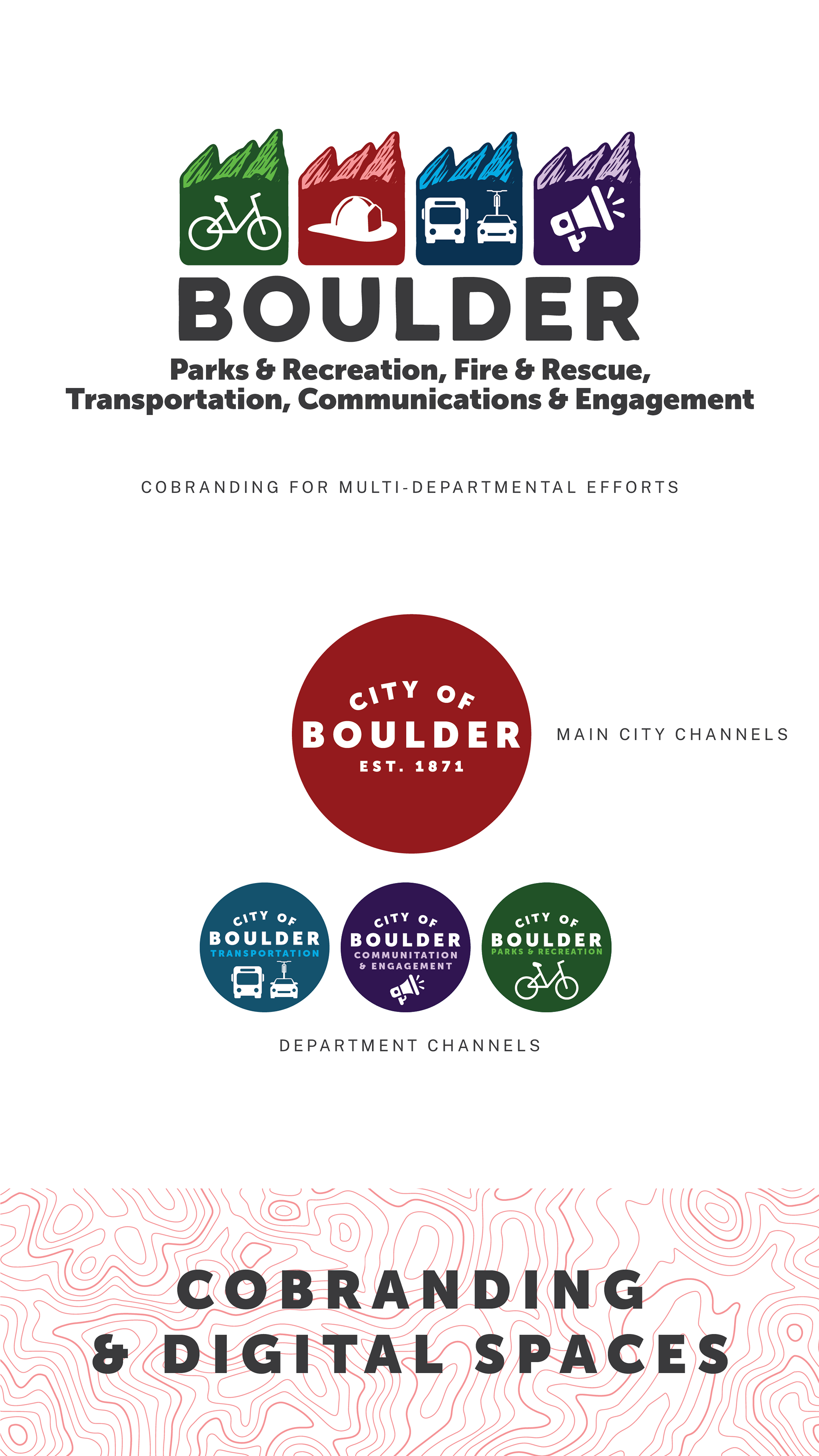
Department Marks: Unique Identity & On-Brand Flexibility
Each department connects with our community in unique and meaningful ways. Allowing departments to select their own color combinations and icon sets fosters buy-in and lets communications speak directly to their audiences.
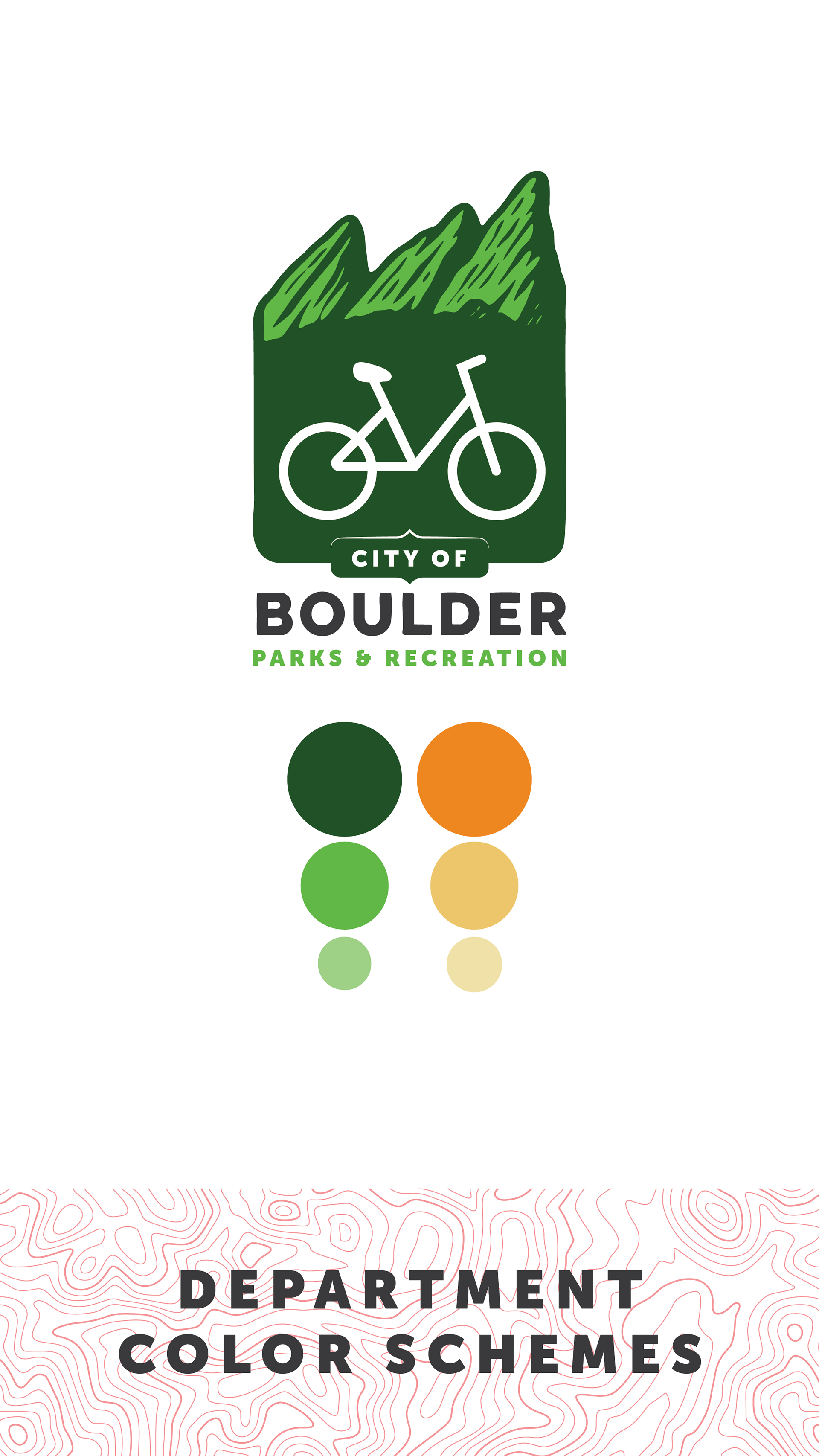
(Optional) Department Color Schemes:
One primary color for their sub-brand
One secondary color (both may be tinted for accessibility).
These colors do not need to be Red Rocks Rust or Municipal Black.
Municipal Black must be used for the “BOULDER” wordmark.
Cobranding & Digital Media Marks: Optimizing Our Brand for Inclusion & Access
When producing collateral among multiple departments, this brand proposes a system for that. Aligning the department icons above the “BOULDER” wordmark and writing their names below. This eliminates the need for multiple logos and instead allows us to lean on our brand and shows that we’re all in this together.
To support digital storytelling and platform-specific clarity, we’ve introduced a suite of digital media marks. These are optimized for avatars, thumbnails, and social headers—where space is tight and recognition matters. Each mark distills the essence of its department or initiative into a bold, legible form that travels well across screens. Whether it’s a circular icon for Instagram or a square badge for Slack, these assets ensure Boulder’s identity remains consistent, visible, and vibrant in the digital wild.
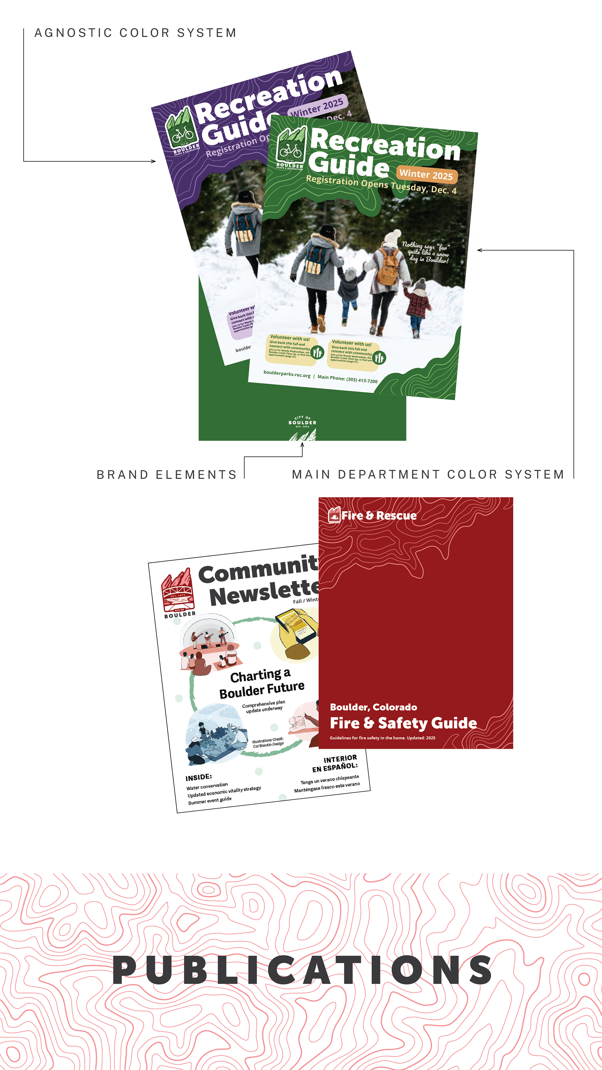
Publications & Print Suite: Examples of How We Tell Our Story
Included here are some samples of what the brand could look like in action. Bold, bright, and beautiful. Just like our city and communities.
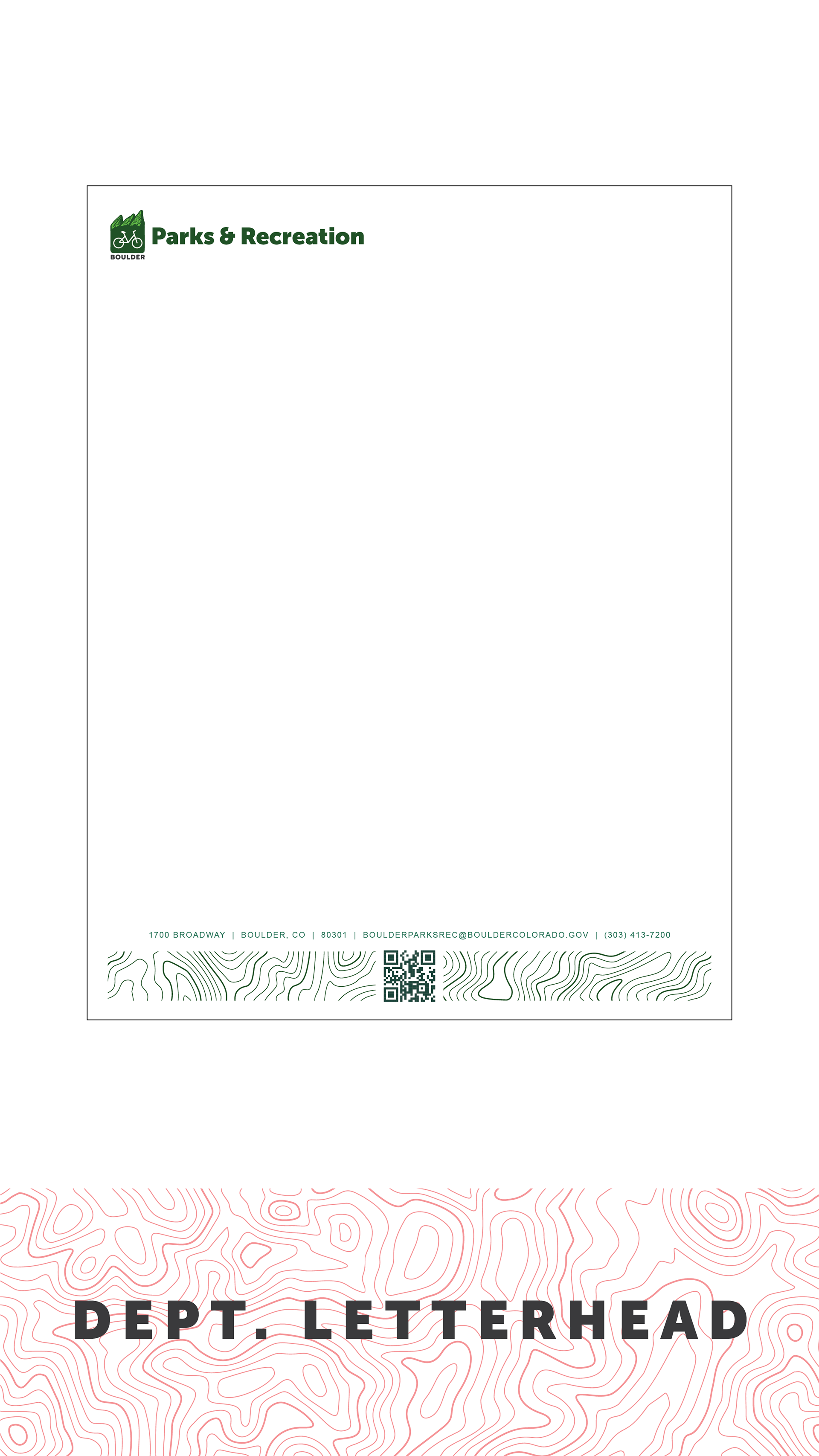
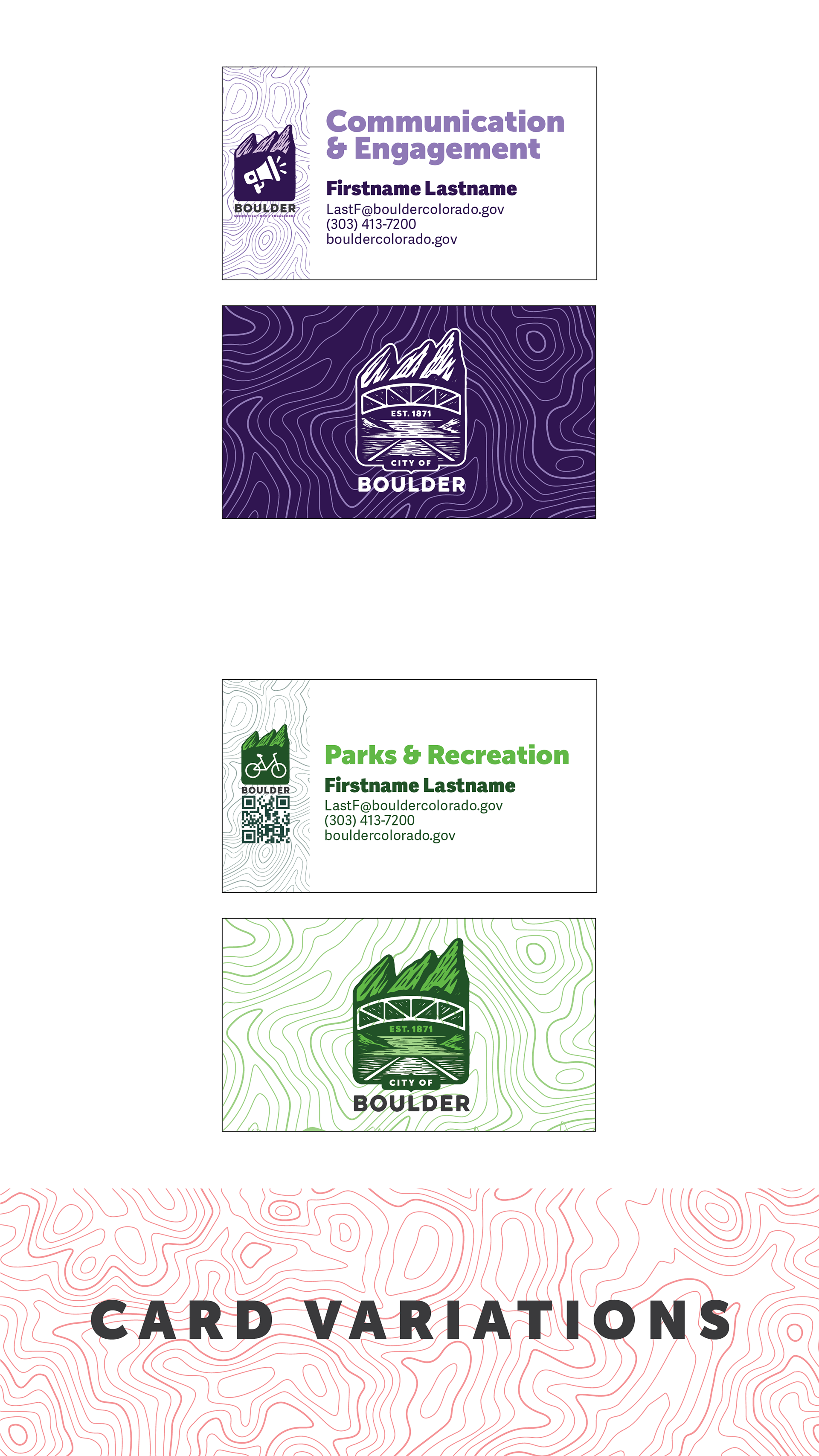
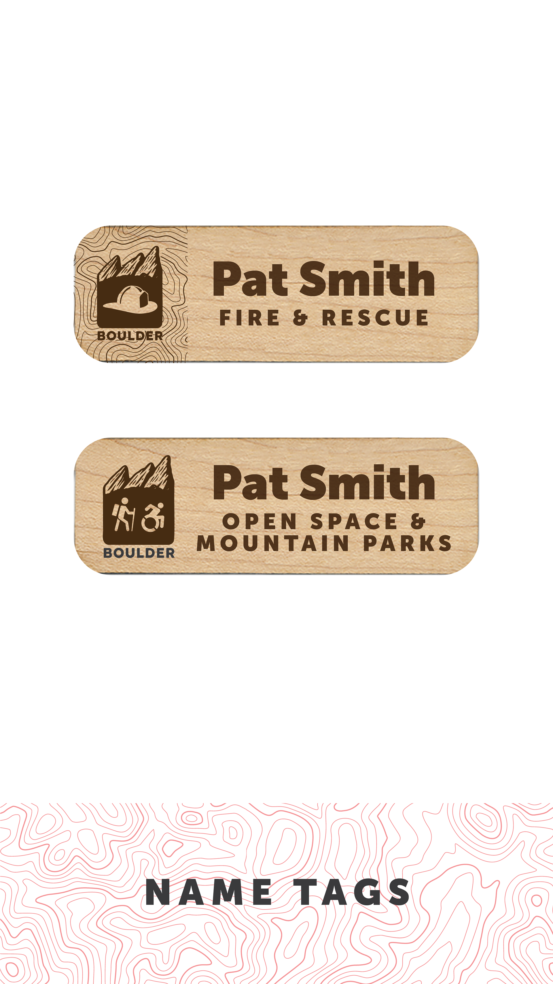
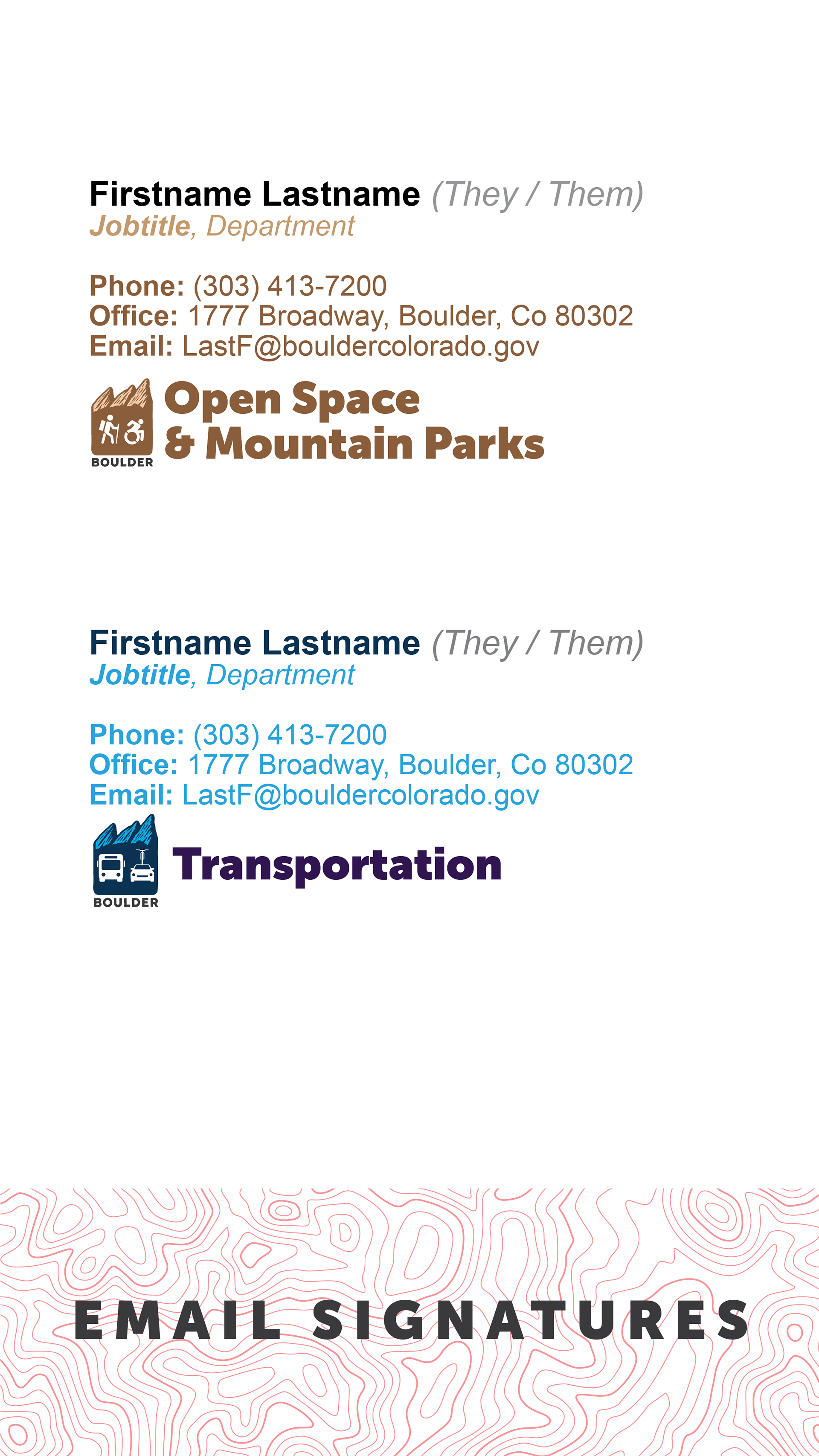
Business Cards, Email Signatures & Name Tags: Customer Service Without Hierarchy
Business cards and name tags do not include job titles. This underscores our commitment to excellent customer service at every level—regardless of role or department. Cards may include QR codes linking to online resources, reinforcing accessibility and connection.
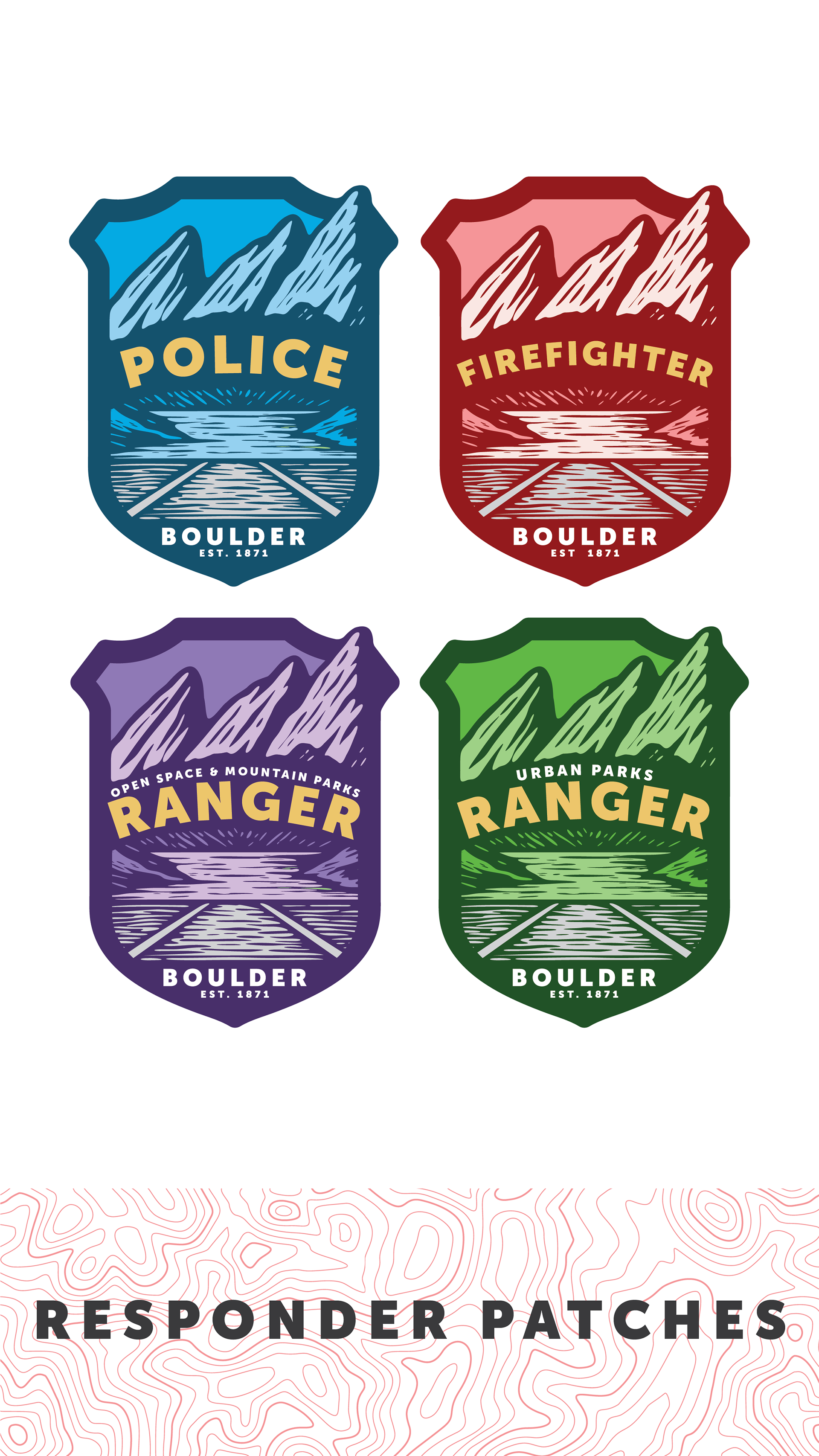
Responder Patches: Honoring & Celebrating Our First Responders
Proposed patches for first responders and crisis staff identify employees a part of the city system and celebrate their contributions.
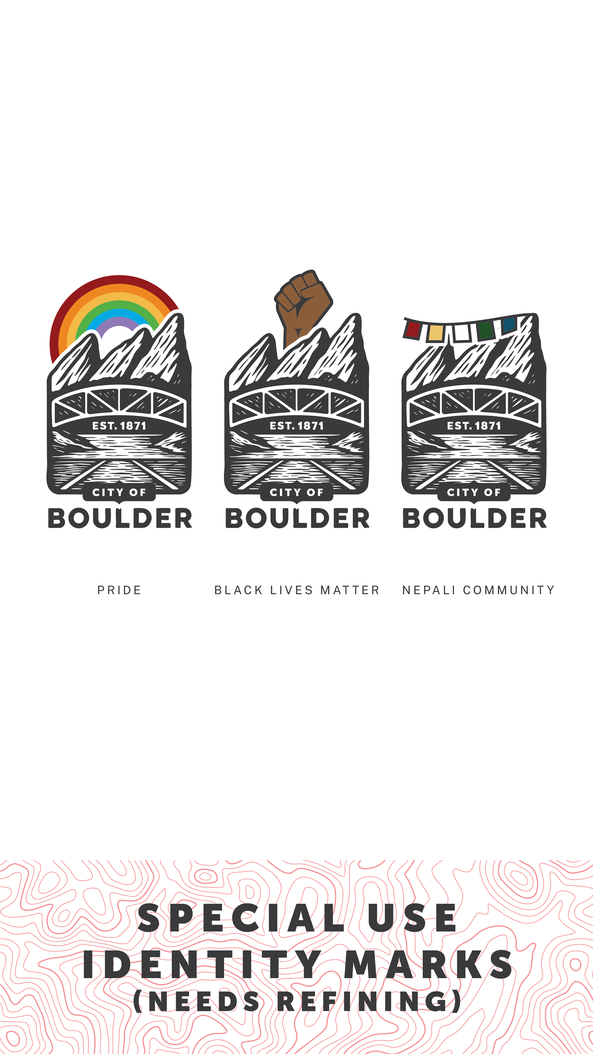
Special Use Identity Marks: Together We Shine
Specialty marks may be created for identity groups, events, and special occasions—celebrating the diverse makeup of our city and the contributions of communities from all backgrounds. Any community group may request a custom identity mark. These will be developed in partnership with community members and maintained by the City Manager’s Office. Art files will not be shared externally to preserve brand integrity.
The Look of Us
This brand system is more than a toolkit—it’s a reflection of who we are and how we show up. It honors Boulder’s natural beauty, its layered and evolving histories, and the everyday moments that make this city feel like home. From the Flatirons to Boulder Creek, from department patches to community marks, every element is designed to deepen connection, foster belonging, and celebrate the vibrant complexity of our shared landscape. It’s not just how we look—it’s how we live: together.